
The Power of Data Visualization, Part 1
We’re Visual Processors
Our brains are wired for fast visual processing, and there’s an important reason: For our ancestors, the ability to quickly detect subtle visual cues made the difference between finding dinner and being dinner. This ability absolutely remains with us today.
Psychology has uncovered the attributes our visual system detects even before focused attention, which are known as pre-attentive attributes. Financial analysts, data miners, interaction designers, and graphic designers all use pre-attentive attributes to get the brain immediately focused on something specific. It’s a way to help the reader see something before they even know they have seen it.
Two pre-attentive attributes that are helpful in creating effective, insightful data visualizations are color and form. The following examples illustrate how these attributes can make your financial reports much more useful and actionable to support fast, effective decision making.
Example 1: How Color Can Help You Spot What’s Important
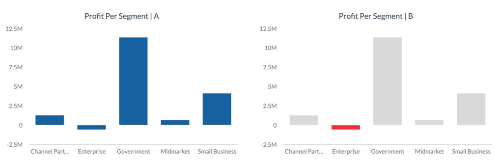
When you look at these two charts, what most stands out? One of the most telling findings is that the Enterprise segment reported negative profits during this period. That finding stands out much more clearly in the chart on the right (where the Enterprise segment is depicted in a different color) vs the chart on the left (where all segments are depicted in the same color). In just seconds you can see that the Enterprise segment needs attention. Using different color hues, saturation, or brightness in a data visualization can help ensure you don’t miss critical trends or insights.
Example 2: How Shape and Size Can Tell You a Story
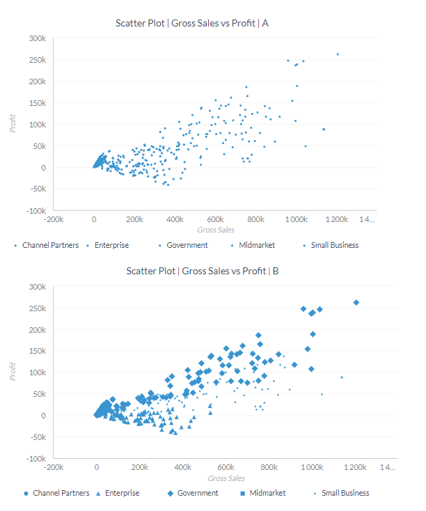
Charts like these enable you to view how multiple segments compare along two different attributes – in this case, sales vs profit. But in the first chart, the combination of size and shape makes it difficult to discern which segments are performing the strongest. By using different shapes and sizes for each segment, the second chart makes it easier to see how those segments are performing with regard to sales vs profit.
Example #3: How the Right Type of Chart Can Point You to Insights
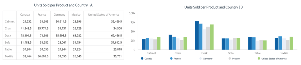
In this example, the table format offers significant detail about how each product category is selling in each country. But it’s not easy to look at the table and walk away with a few targeted insights. By contrast, the bar graph delivers more insight because it leverages the fact that people can easily distinguish the lengths of different items. For example, with the bar graph it’s very easy to tell that you’re selling a lot of desks in Canada.
The numbers are still accessible with a bar graph (usually by double-clicking or hovering over the bar), but the graph tells the high-level story at a glance. Even if you export the data from a visualization over to another format, like an Excel or CSV file, the beauty is you already have the insights that the detailed data supports.
Example #4: How the Orientation of Your Chart Can Speed Decision Making
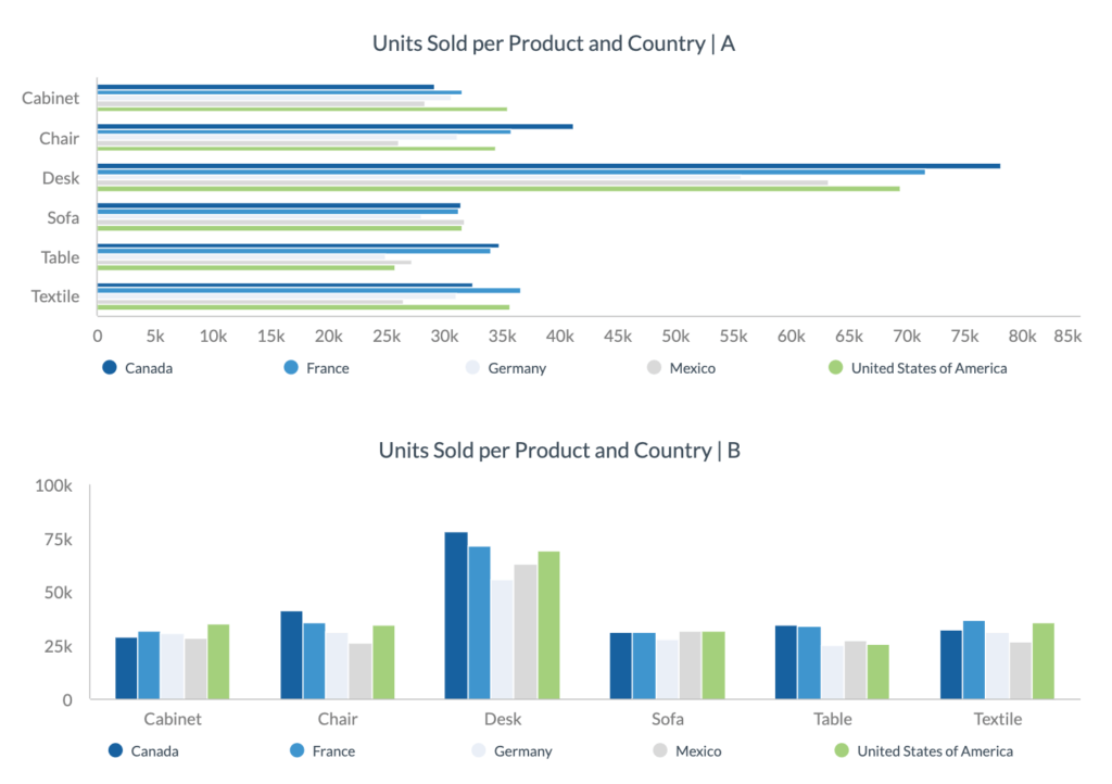
As these graphs illustrate, something as simple as the orientation of your graph can make a difference in how usable the information is. In the first graph, because most of the lines are long and all of the lines are narrow in width, it’s not easy to spot differences in how various product categories are selling in different countries. With the second graph, in just a few seconds you can see that desks are the best-selling product category overall, and that desks are selling especially well in Canada and France.
Example #5: How Width Can Help You Understand What a Chart is Telling You
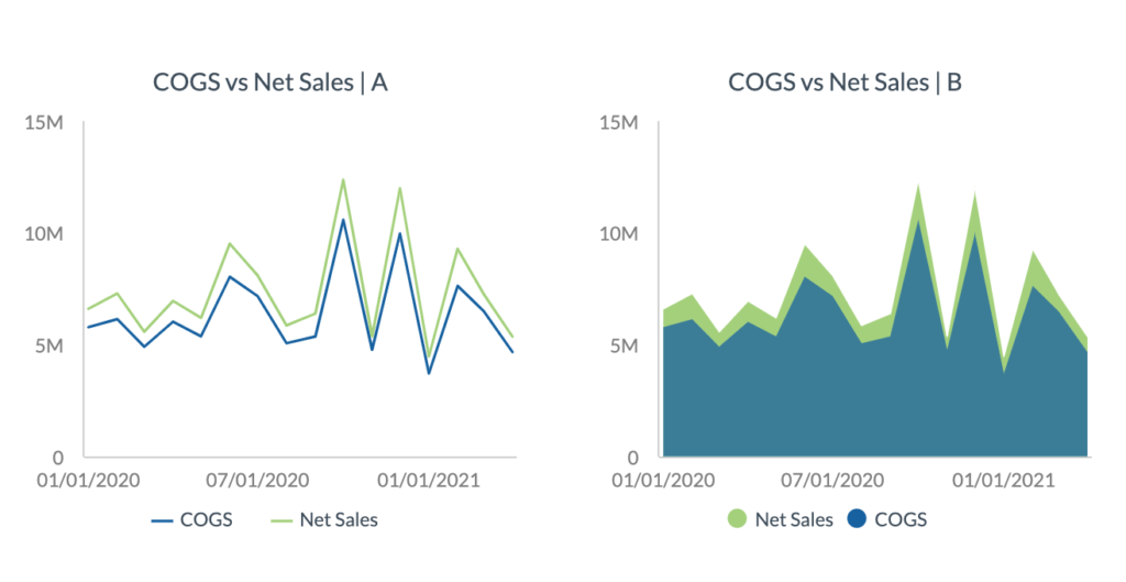
These two charts convey the same data: how COGS (cost of goods sold) compares to net sales. The space between the COGS line and net sales line is what your eye is supposed to focus on, because the size of that space is what is relevant. However, that’s much easier to discern in the chart on the right vs the chart on the left.
When a chart contains a great deal of white space, it can be visually challenging to understand what you’re looking at. By filling in the white space below the COGS line with one color, then filing in the space between the COGS and net sales lines in a different color, the chart on the right makes it clear that COGS makes up a large portion of net sales.
As you can see from these examples, leveraging pre-attentive attributes like color and form can transform your financial reporting—resulting in data visualizations that immediately draw your attention to key points, help you glean insights, and support fast, effective decision making.
If you’re ready to turn your financial reporting into a powerful decision-making tool using data visualization, schedule a meeting with Scrubbed’s Data Visualization team here. If you want to learn more and try out our demo dashboard, click here.
Look for Part 2 in this series, which will focus on how providers like Scrubbed use another tool gleaned from psychology—gestalt principles—to deliver data visualizations that improve decision making.
This approach also enhances ESG reporting services, helping stakeholders interpret key sustainability and governance metrics more effectively. It is equally valuable for specialized industries, where biotech accounting services require clear, accurate reporting to meet strict compliance and regulatory standards.
About the Author
Francis has over five years of combined experience analyzing data, building and managing dashboards in sales, marketing, supply chain and business processes. He is currently working on automating cloud-based financial, social media and inventory dashboards for the Data Visualization team at Scrubbed.