
How Gestalt Principles Improve Your Data Presentations
Gestalt is a well-known psychology theory about how our brains create structure by default. Even if you haven’t heard the term Gestalt, it’s likely you’re aware of this theory because it is encapsulated in the commonly used phrase, “The whole is greater than the sum of its parts.” While there are many Gestalt principles, here we focus on four that are especially relevant to data visualizations and can be used to supplement pre-attentive attributes like color, shape, and size.Simplicity
Our minds look for simplicity in complex shapes. It is easier to perceive meaning from something simple because it avoids information overload. Reducing jargon, sorting data, and limiting the number of colors are all examples of simplicity in data visualizations. The top graph was used in the first part of our series to illustrate how bar graphs can tell a clearer story, at a glance, than data tables. But we can further improve the graph by simplifying it, as shown in the second version.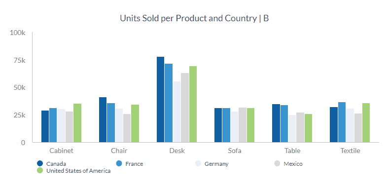
Once we sort the bars in descending order, it becomes even easier to see how each country ranks by product. For example, it’s clear that Canada ranks number one in units of desks sold, first in chairs sold, third in textiles, and so on. In the earlier iteration of the chart, determining how a given country ranked by each product category involved a bit of eye strain.
Proximity
When elements are positioned close to each other, they are perceived to be in the same group.
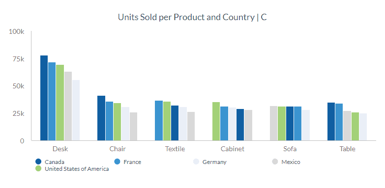
In the first iteration of the following graphic, different product categories can be identified easily because the extra space between each category helps distinguish one from another. If the goal is to check the sales performance of each country on a particular product category, this graph works just fine.
But what if you want to know how many products were sold to a particular country? Using the first graph, how long would it take you to determine the total sales of desks, chairs, textiles, and other categories to Canada?
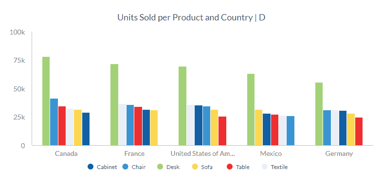
Using the proximity principle differently in the second graph, it’s now easier to distinguish all product category sales for each country. How long does it take you to compare all product category sales to Canada this time?
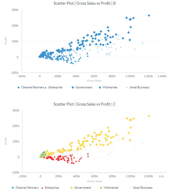
Similarity
The principle of simplicity states that objects with similar characteristics are perceived as part of the same group. In Part 1 of this series, we changed the shape and size of the categories in the graph below so that they’re similar to each other. While it’s possible to identify the different categories already, adding another characteristic—color—makes it even easier to differentiate the groups.
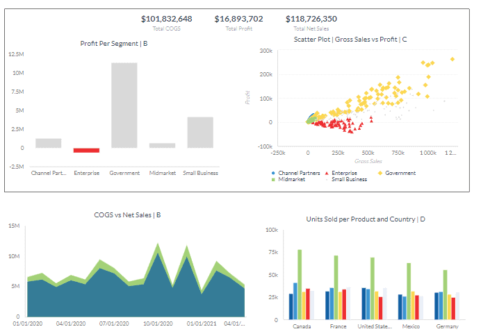
Enclosure
The enclosure principle states that objects enclosed in a border are perceived to be part of one group. Placing a border enclosure on the first half of the image below indicates that these two graphs should be interpreted together. The border also makes the group stand out.
ABOUT THE AUTHOR
Francis has over five years of combined experience analyzing data, building and managing dashboards in sales, marketing, supply chain and business processes. He is currently working on automating cloud-based financial, social media and inventory dashboards for the Data Visualization team at Scrubbed.